


Linked In
Behance
Resume
B2C | Web
Arabi e-Mart Modernizing eCommerce
for Discovery and Conversions
Our Core Questions to solve
Arabi e-Mart is Arab Bank’s B2C eCommerce platform, enabling customers to browse products, discover exclusive offers, and shop securely. However, the existing experience no longer aligned with evolving customer expectations or modern eCommerce standards.
Although functionally complete, the platform lacked the personalization, interactivity, and convenience expected from modern eCommerce experiences. Product discovery was difficult, promotions lacked visibility, and users had limited support for informed purchase decisions.
The challenge was to modernize the existing experience with features that reduced friction, improved engagement, and increased purchase confidence.
1M+
Users
80%
Arab Bank Users
40%
Daily Users
12%
Flow Completors
UX Audit & Behavioral Analysis
Evaluated existing shopping journeys, user behavior, heatmaps, and click patterns to identify friction and improvement opportunities.
Competitive & Market Benchmarking
Analyzed leading eCommerce experiences to identify modern patterns, industry standards, and opportunities for differentiation.
Stakeholder & Technical Alignment
Collaborated with stakeholders and developers to align business priorities, customer needs, and technical feasibility.
Why are users struggling to discover relevant products?
Why are promotions receiving low engagement?
Why are users abandoning products before checkout?
Why does the shopping journey feel disconnected?
Why doesn’t the platform feel like a modern eCommerce experience?
Collaboration
Key Learnings
As Observed
As Observed
As Observed
As Observed
As Observed
Users frequently left product pages without adding items to their cart. Research suggested that the product pages lacked sufficient information and confidence-building elements to support purchase decisions.
Customers wanted to compare products, understand available offers, and quickly evaluate whether an item met their needs.
Users were spending too much time browsing multiple categories before finding products that matched their interests. The homepage relied heavily on static banners and generic product listings, making discovery feel overwhelming.
Customers expected a shopping experience that surfaced relevant products quickly instead of requiring extensive navigation.
Although the platform regularly offered discounts and bank-exclusive deals, many users overlooked promotional campaigns because banners blended into the overall interface.
Promotions lacked urgency and failed to communicate their value effectively.
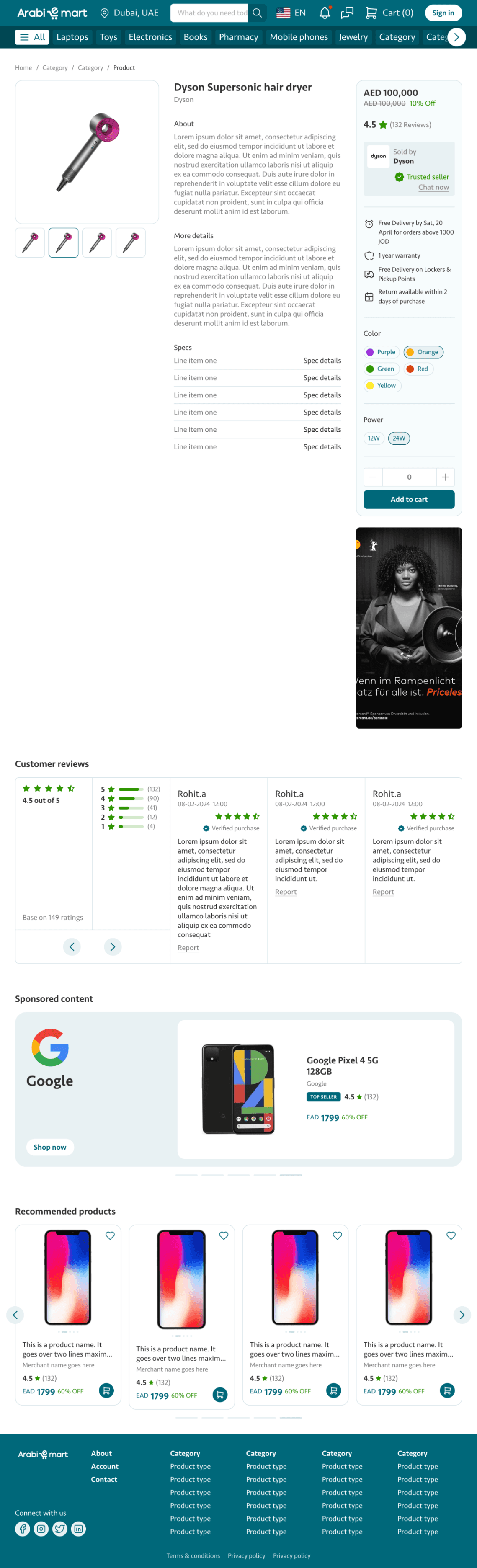
The product detail page was redesigned with a stronger information hierarchy. Rich product galleries, specifications, customer ratings, delivery information, financing options, and promotional highlights were surfaced more prominently. Features such as wishlists, product comparison, recently viewed items, and related recommendations helped customers make informed decisions without leaving the page.
he experience across browsing, product pages, cart, and checkout lacked consistency. Interaction patterns, visual hierarchy, and navigation differed between sections, creating unnecessary cognitive load during shopping.
Compared with leading online retailers, the interface lacked many of the convenience features customers had come to expect. The absence of quick interactions, personalized recommendations, and dynamic content made the platform feel static despite offering a wide product catalog.
The project involved close collaboration across multiple teams to balance business goals with customer needs.
I worked with:
Product Managers to prioritize features based on customer value.
Business stakeholders to align promotional strategies and campaign requirements.
Developers to ensure technical feasibility and scalable implementation.
Marketing teams to improve visibility of offers and seasonal campaigns.
QA teams to validate usability and consistency across devices.
This project demonstrated that modernizing an eCommerce platform is not always about introducing entirely new functionality. Often, meaningful improvements come from reducing friction, improving discoverability, and presenting information more intelligently.
By focusing on customer behavior rather than simply refreshing the visual design, Arabi e-Mart evolved into a more intuitive and engaging shopping experience that aligned with modern eCommerce expectations while continuing to support Arab Bank’s broader digital ecosystem.
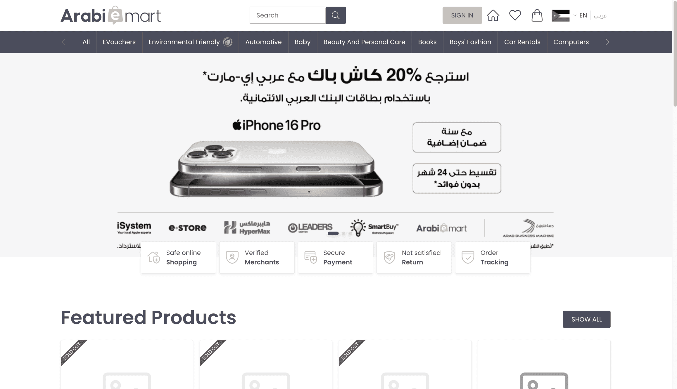
The homepage was redesigned to become more personalized and discovery-driven. Dynamic product sections such as Trending Products, Recently Viewed, Recommended for You, New Arrivals, and Limited-Time Offers were introduced to help users find relevant products faster. Product cards were enhanced with quick actions, promotional badges, and richer visual hierarchy, reducing browsing effort while improving engagement.
A modern promotional framework was introduced using countdown timers, limited-stock indicators, promotional labels, and contextual offer cards throughout the shopping journey. Instead of isolating promotions to the homepage, offers became visible at product listing, product detail, and checkout stages, ensuring customers encountered relevant deals at the right moments.
A unified shopping experience was established by standardizing layouts, navigation patterns, spacing, typography, buttons, and interaction behaviors across every stage of the customer journey. This consistency reduced friction and created a more predictable shopping experience that felt cohesive from product discovery through checkout.

The redesign introduced a collection of modern UX enhancements focused on speed and convenience. Quick product previews, enhanced search and filtering, sticky action bars, interactive product cards, personalized recommendations, improved micro-interactions, skeleton loading states, and smoother checkout transitions created a more engaging shopping experience while preserving the platform’s existing business workflows.



Careem was our main inspiration and competitor, helping us understand modern user experiences and industry standards.
Design Principles
Discover Faster
Help users find relevant products quickly through better navigation, personalization, and intelligent content organization.
Build Purchase Confidence
Present clear product information, offers, and comparisons to help customers make confident purchasing decisions.

Simplify and Modernize
Reduce friction across browsing, cart, and checkout while introducing modern eCommerce patterns without disrupting familiarity.


Impact on product
Customer Impact
Business Impact
Faster product discovery through personalized recommendations.
Improved confidence during purchase decisions.
Better visibility of offers and promotions.
Reduced effort across browsing and checkout.
More engaging and modern shopping experience.
Increased product engagement.
Higher add-to-cart conversion.
Improved promotion visibility and campaign performance.
Reduced cart abandonment.
Increased customer retention through personalized shopping experiences.


Old Approach
Offers and timers are not visible and clear
Two approaches
Popup style and
Top Bar style
Not a proper layout with lesser details
Here we add much details to shorter the flow journey
New Approach with Offer section Segmentations
B2C | Web
Arabi e-Mart Modernizing eCommerce
for Discovery and Conversions
Our Core Questions to solve
Arabi e-Mart is Arab Bank’s B2C eCommerce platform, enabling customers to browse products, discover exclusive offers, and shop securely. However, the existing experience no longer aligned with evolving customer expectations or modern eCommerce standards.
Although functionally complete, the platform lacked the personalization, interactivity, and convenience expected from modern eCommerce experiences. Product discovery was difficult, promotions lacked visibility, and users had limited support for informed purchase decisions.
The challenge was to modernize the existing experience with features that reduced friction, improved engagement, and increased purchase confidence.
1M+
Users
80%
Arab Bank Users
40%
Daily Users
12%
Flow Completors
UX Audit & Behavioral Analysis
Evaluated existing shopping journeys, user behavior, heatmaps, and click patterns to identify friction and improvement opportunities.
Competitive & Market Benchmarking
Analyzed leading eCommerce experiences to identify modern patterns, industry standards, and opportunities for differentiation.
Stakeholder & Technical Alignment
Collaborated with stakeholders and developers to align business priorities, customer needs, and technical feasibility.
Why are users struggling to discover relevant products?
Why are promotions receiving low engagement?
Why are users abandoning products before checkout?
Why does the shopping journey feel disconnected?
Why doesn’t the platform feel like a modern eCommerce experience?
Collaboration
Key Learnings
As Observed
As Observed
As Observed
As Observed
As Observed
Users frequently left product pages without adding items to their cart. Research suggested that the product pages lacked sufficient information and confidence-building elements to support purchase decisions.
Customers wanted to compare products, understand available offers, and quickly evaluate whether an item met their needs.
Users were spending too much time browsing multiple categories before finding products that matched their interests. The homepage relied heavily on static banners and generic product listings, making discovery feel overwhelming.
Customers expected a shopping experience that surfaced relevant products quickly instead of requiring extensive navigation.
Although the platform regularly offered discounts and bank-exclusive deals, many users overlooked promotional campaigns because banners blended into the overall interface.
Promotions lacked urgency and failed to communicate their value effectively.
The product detail page was redesigned with a stronger information hierarchy. Rich product galleries, specifications, customer ratings, delivery information, financing options, and promotional highlights were surfaced more prominently. Features such as wishlists, product comparison, recently viewed items, and related recommendations helped customers make informed decisions without leaving the page.
he experience across browsing, product pages, cart, and checkout lacked consistency. Interaction patterns, visual hierarchy, and navigation differed between sections, creating unnecessary cognitive load during shopping.
Compared with leading online retailers, the interface lacked many of the convenience features customers had come to expect. The absence of quick interactions, personalized recommendations, and dynamic content made the platform feel static despite offering a wide product catalog.
The project involved close collaboration across multiple teams to balance business goals with customer needs.
I worked with:
Product Managers to prioritize features based on customer value.
Business stakeholders to align promotional strategies and campaign requirements.
Developers to ensure technical feasibility and scalable implementation.
Marketing teams to improve visibility of offers and seasonal campaigns.
QA teams to validate usability and consistency across devices.
This project demonstrated that modernizing an eCommerce platform is not always about introducing entirely new functionality. Often, meaningful improvements come from reducing friction, improving discoverability, and presenting information more intelligently.
By focusing on customer behavior rather than simply refreshing the visual design, Arabi e-Mart evolved into a more intuitive and engaging shopping experience that aligned with modern eCommerce expectations while continuing to support Arab Bank’s broader digital ecosystem.
The homepage was redesigned to become more personalized and discovery-driven. Dynamic product sections such as Trending Products, Recently Viewed, Recommended for You, New Arrivals, and Limited-Time Offers were introduced to help users find relevant products faster. Product cards were enhanced with quick actions, promotional badges, and richer visual hierarchy, reducing browsing effort while improving engagement.
A modern promotional framework was introduced using countdown timers, limited-stock indicators, promotional labels, and contextual offer cards throughout the shopping journey. Instead of isolating promotions to the homepage, offers became visible at product listing, product detail, and checkout stages, ensuring customers encountered relevant deals at the right moments.
A unified shopping experience was established by standardizing layouts, navigation patterns, spacing, typography, buttons, and interaction behaviors across every stage of the customer journey. This consistency reduced friction and created a more predictable shopping experience that felt cohesive from product discovery through checkout.
The redesign introduced a collection of modern UX enhancements focused on speed and convenience. Quick product previews, enhanced search and filtering, sticky action bars, interactive product cards, personalized recommendations, improved micro-interactions, skeleton loading states, and smoother checkout transitions created a more engaging shopping experience while preserving the platform’s existing business workflows.
Careem was our main inspiration and competitor, helping us understand modern user experiences and industry standards.
Design Principles
Discover Faster
Help users find relevant products quickly through better navigation, personalization, and intelligent content organization.
Build Purchase Confidence
Present clear product information, offers, and comparisons to help customers make confident purchasing decisions.
Simplify and Modernize
Reduce friction across browsing, cart, and checkout while introducing modern eCommerce patterns without disrupting familiarity.
Impact on product
Customer Impact
Business Impact
Faster product discovery through personalized recommendations.
Improved confidence during purchase decisions.
Better visibility of offers and promotions.
Reduced effort across browsing and checkout.
More engaging and modern shopping experience.
Increased product engagement.
Higher add-to-cart conversion.
Improved promotion visibility and campaign performance.
Reduced cart abandonment.
Increased customer retention through personalized shopping experiences.
Old Approach
Offers and timers are not visible and clear
Two approaches
Popup style and
Top Bar style
Not a proper layout with lesser details
Here we add much details to shorter the flow journey
New Approach with Offer section Segmentations

